For those interested – this is how and why this plugin came to be. If you’re looking for the docs – they’re being written – link coming soon.
So I thought I’d write a post about a project I’ve been working on, a new plugin – Custom Layouts.
The plugin offers some familiar features that you’ve seen before, packaged in themes or available in a myriad of plugins free and paid for.. that is:
The ability to display posts or products, in a list or grid
So why did I decide to create the same thing that’s been done many times over before? Let’s cover a bit of background.
The Background
This plugin started as a feature idea for another plugin I develop (Search & Filter). That plugin allows you to create filters on the frontend of your site, so your users can find the content they are looking for.
Since the early days of developing Search & Filter, our users have been asking us how to customize the results/layouts. Our approach has been to integrate with some of the excellent themes and plugins out there (and for developers, there are plenty of options built-in)…
But we always found scenarios where our users couldn’t use a provided integration, or didn’t want to buy into a whole ecosystem to customize a layout, or, wanted to use a plugin that we didn’t yet provide an integration for.
So it seems the best way to serve our users is to offer these features in some shape or form as a “catch-all”. An option for our users who couldn’t use the other offerings – or even eventually as a preferred option.
To create a feature or a new plugin?
As a set of features
Although this where the idea/requirement came from, this option I preferred less.
- Having this hidden as a sub-feature of another product is not doing all that functionality and time invested, justice.
- It will add bloat (many people will not need it) to the Search & Filter plugin
- Limited exposure to the existing user base of the filter plugin
As a plugin
This seemed to be the right direction. If we’re going to build something well, with a decent set of features, then it makes sense to manage it on its own.
Not only that, but it’s clear there is a huge market for these kinds of plugins. It can stand on its own and there would be plenty of people (I hope) wanting to use this standalone.
We would then benefit from added traffic/sales to Search & Filter via users of this new plugin – bonus 🙂
And what about a premium version? For now, this doesn’t interest me. The idea is not to be the most comprehensive offering on the market – or to cater to a niche (good reasons to put a price tag on).
I like the idea of creating something and giving it away (and let’s be honest, this option still has it’s benefits) – I’ve personally gained so much from the WordPress ecosystem and I’ve given back here and there, but I think this could be a more substantial contribution.
Requirements
So what started out as a feature idea for a premium plugin, turned out to be a fully-fledged project of its own. With this came a new set of requirements and considerations:
- Allow users to build highly customized layouts for lists/grids of posts
- Integrate seamlessly with our existing plugin Search & Filter Pro
- Be incredibly easy to use
- Improve on the existing offerings (if we’re going to build something that’s been built many times before, we really should have some good reasons to do so – such as improving features/ease of use is a good enough excuse for me)
- Work well in as many installs/environments as possible (as is the nature of building a plugin for the plugins repo)
Improving on existing solutions
To be honest there are so many great options and there’s really nothing obvious that stands out. However, I have identified one area I think is a common pain point for most existing solutions – a cluttered UI.
Problems with a cluttered UI
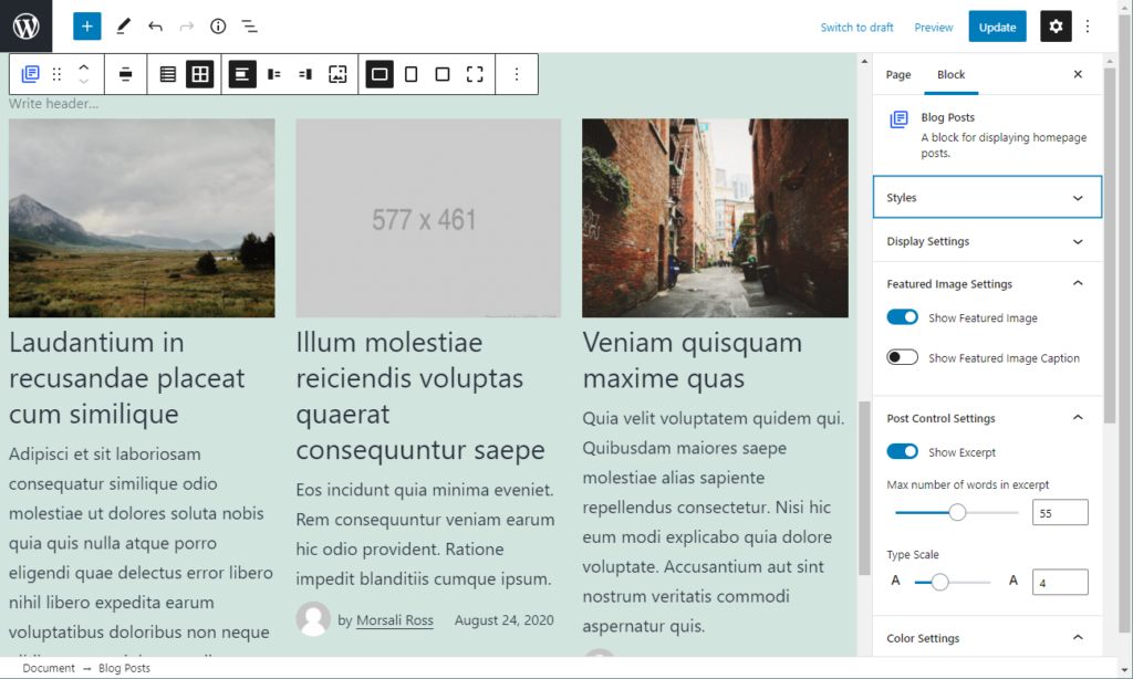
In order to offer more features to the user, all solutions must provide more options (generally speaking)… In the era of page builders and WYSIWYG editors, current solutions are in general, fantastic. But many suffer from the same thing – adding hundreds (well maybe not that many) of customization options, in 1 sidebar/panel (ala Gutenberg + Elementor plugins) or adding too many options to the block toolbar.

Sorry Automattic – there’s actually nothing wrong with this… (yet?)
So there are two ways I think most offerings are going: add more features and clutter the UI, or limit features and improve the editing experience (by the way I’m not advocating that more options are always better, but in some use cases you really do want to offer more features but can’t).
In the example above, I think we’re already reaching a critical point in terms of offering options to the user – there are certainly enough toolbar options, and while the sidebar has been carefully managed to not be too overwhelming, you can easily see that if we want to start adding individual options for things like the post title, author section – then it’s going to start affecting the user experience.
Anyway, for this particular plugin, I’d rather not choose – I want to offer more options and I want it to be easy to use (I’m demanding)… The good thing is, I think this problem has already been solved for us – in the page builders themselves!
They are the best examples of increasing complexity + features whilst also improving the user experience.
So why not bring the “page builder” paradigm one level deeper into this plugin?
Another layer of abstraction
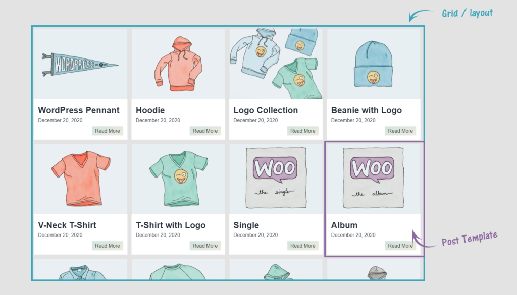
In my opinion, there is a clear separation between the list/grid layout and the design of each individual item/result.
* There has always been a clear separation of these two areas in WordPress itself and may be better known as “the loop” and “template part”.

If we separate the two, we achieve 2 things:
- A higher degree of customizability with the individual item/template
- Simplify the process of adding a layout/grid/list and declutter this experience
The solution: separate the layout from the post template
That’s it – we should provide a visual page builder type solution to building layouts and templates, but, not together in the same widget/block…
Cue the Custom Layouts plugin 🙂
Implemenation (+ Gutenberg)
So there could be a few approaches to create something like this while ticking off the requirements:
Using the Block Editor as the foundation
I thought about the potential to use Blocks for the layout, and InnerBlocks for the post templates – I’m not 100% that this is the easiest way to do this for user experience – nor is the implementation (as far as I can tell) of InnerBlocks mature enough to build upon – I’d rather wait a little while (and learn a bit more)…
This option also has the huge caveat of forcing the plugin to be available to Block Editor users only.
Building a custom solution
The way forward I felt is to create something that works well on its own (so it works for everyone) and then from there consider how to integrate that with the block editor for a better user experience/workflow (it’s the future, by the way 😉 ).
The solution:
- Regular WordPress CPT’s are registered for layouts + templates
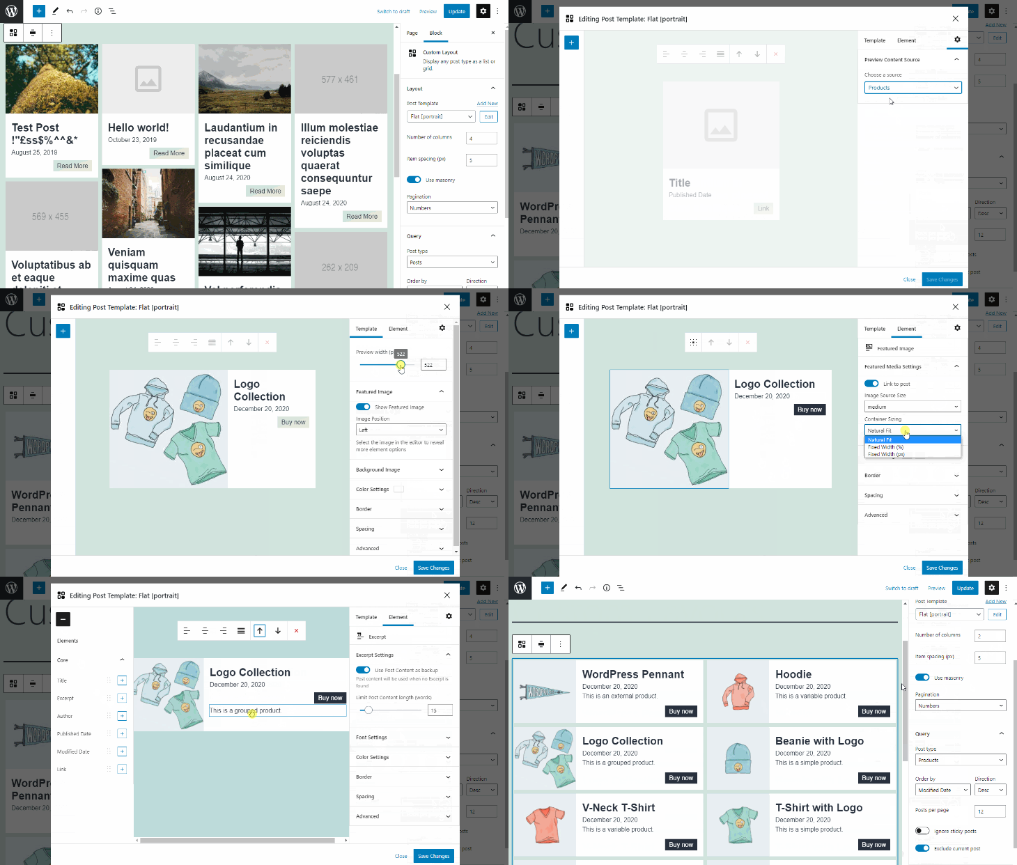
- These CPTs will have custom React Apps for building layouts + templates using a drag and drop interface – we use 90% Gutenberg components for building the UI, so everything looks and feels like WordPress (and so it also works incredibly well)
- Layouts are made available via shortcodes for any WP install so can be placed anywhere
- After this, we tightly integrated our layouts + template editor with the Block Editor by adding a layout block, and linking that with the template editor via a modal, so you never have to leave the editing experience
* Block Editor users – one thing I would say, that while offering a modal for the template editor is a pretty cool experience (stops you from navigating away from the editor) – I’m not 100% sold on if that is the best way to achieve this – it’s a work in progress.
** Also, all modals in the Block Editor are subject to some buggy behaviour – the editor captures keyboard shortcuts and makes changes to the document underneath.
Benefits
So, using this approach now means several things:
- The layout + template editors are available to all WordPress users no matter your choice of editing experience.
- It’s much easier to change what you want – clicking on the post title to bring up the post title options seems much more natural in the template editor rather than burying the options in a panel in a sidebar of a layout.
- We get to (once again) overload the user with options ^^ – well, hopefully not, but we can offer more “sub-options” (ie options for the post title, featured image, etc) more easily now, and they are less confusing + easier to locate.
- Layouts also become simpler to use – they consist of only a few settings, query-related, layout related, and choosing a post template – gone is the overhead of all those options cluttering the sidebar unless you choose to drill down into it.
- Templates and layouts are re-usable – so you can update the template once and see changes reflected across the site. If you are using the Block Editor, you can create a re-usable block for much the same effect. I do see some cross over functionality here which I’m sure will be refined over time.
So there you have it, the making of, so to speak…
After thoughts
This plugin has essentially been the product of 1.5 years of learning React + Gutenberg – and 4 months building this plugin.
I have to say, working with Gutenberg and the Block Editor as a developer is a far superior experience to the old paradigm (the classic editor) – the learning curve is definitely greater, but once you get over the hump it seems the future is bright.
I also love the fact that we don’t actually need to be using the Block Editor to use Gutenberg components – that means we can still build what we want and how we want it (providing we’re using React), whilst keeping the UI in tune with the rest of WordPress.
Saying that, I have experienced some friction with using Gutenberg components in custom React apps – but I’m assuming that will reduce over time.
And it look’s like there are already some developments coming with the g2 components which may resolve some of these pain points – due to better standardization across components.
Anyway, that’s it for this post – if you’ve made it down here, thanks for reading, and let me know your thoughts 🙂


Comments
5 responses to “Creating the Custom Layouts plugin”
[…] greater, but once you get over the hump it seems the future is bright,” he wrote in the plugin’s announcement post. “I also love the fact that we don’t actually need to be using the Block Editor to use […]
Hi Ross
I would just like to you know does one set the results to display in a list format?
Hey Simi, I would change the “number of columns” to `1` that makes them display as a list (one underneath the other).
Then its upto you to choose/design a template that suits that style.
Usually one of the landscape based sample templates work well.
I hope that helps!
Great work on this! Thanks a lot! Hope many people will use it!
Thanks rudi!